With a background in skincare expertise and ingredient-led knowledge, skincare gurus Nip+Fab needed a website refresh to match.
- Client NIP+FAB
- Scope UX/UI Design
in sales
Creating a fresh new user experience and website design
With a background in skincare expertise and ingredient-led knowledge, skincare gurus Nip+Fab needed a website refresh to match.
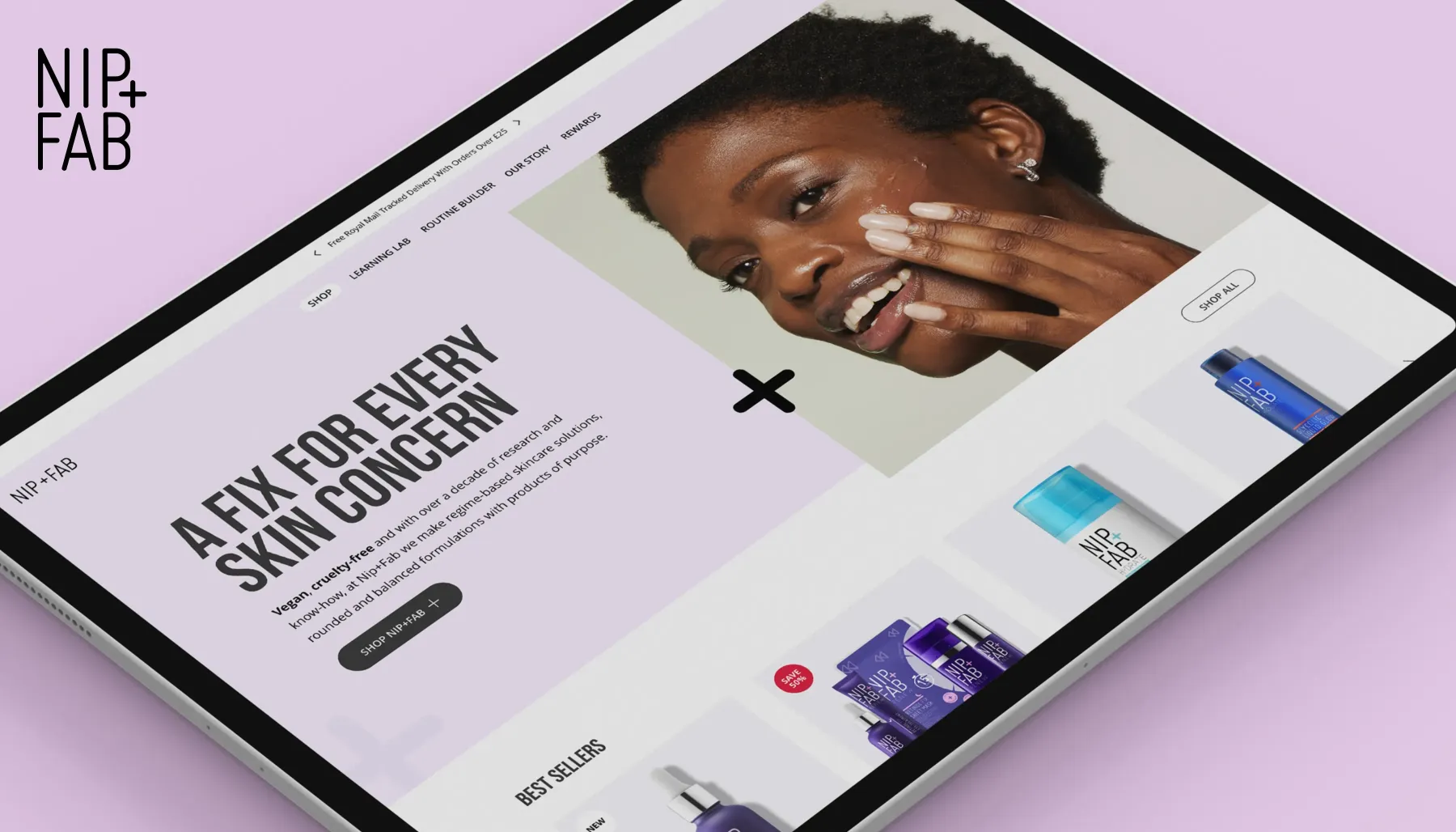
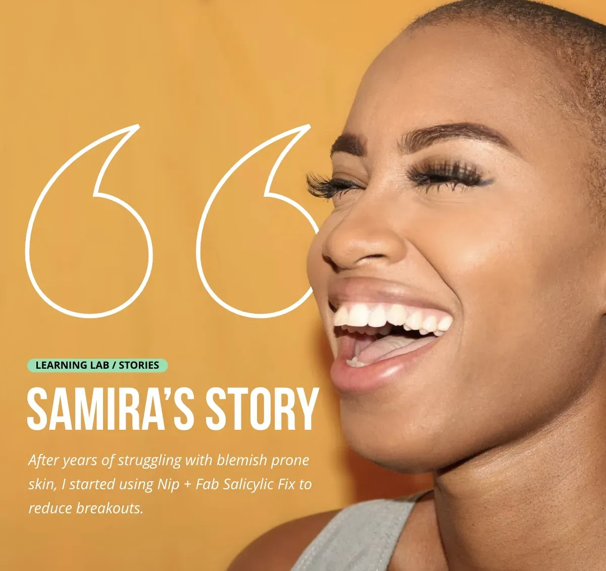
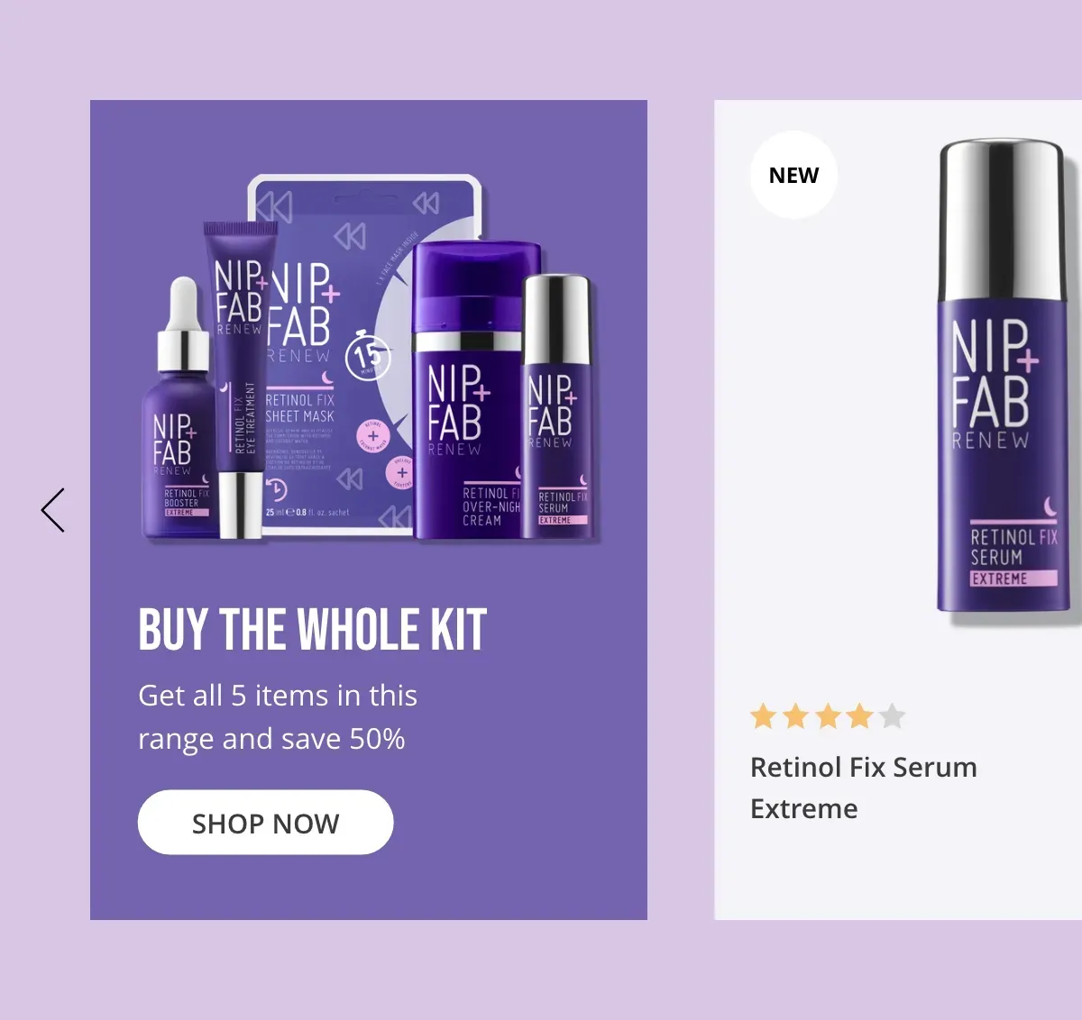
Pull worked with Nip+Fab to conceive and craft a new user experience and website design for the brand. Forging the brand’s knowledge of ingredients and showcasing their range was at the forefront of the website refresh.
The Challenge
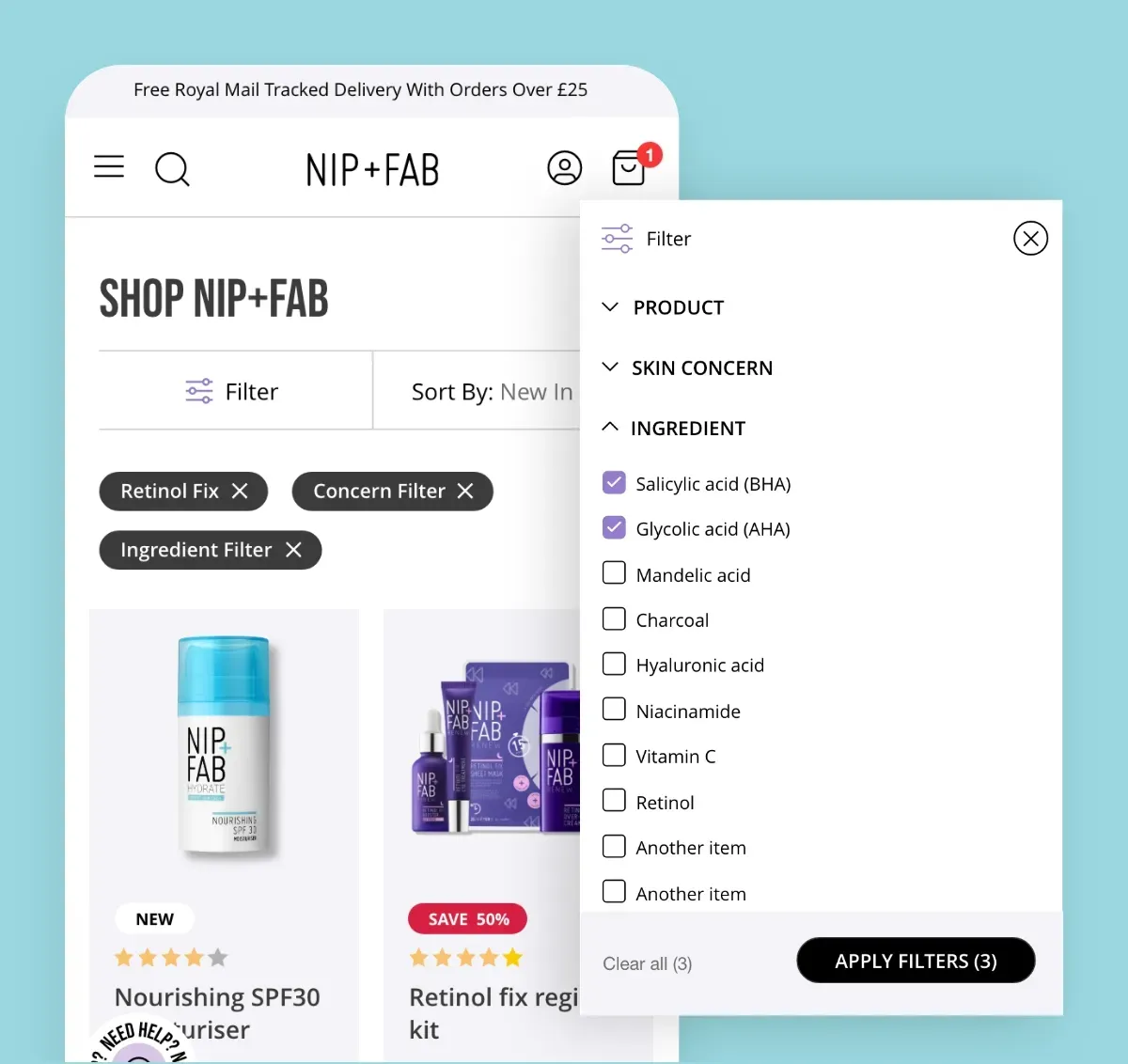
Nip+Fab’s website felt difficult to navigate and devoid of additional content the user might want to read before buying a product. We wanted to go back to the drawing board with the overall user experience so that customers could not only easily shop their favourite products, but learn more about skincare and the hero ingredients that Nip+Fab use. Starting with a UX process allowed us to make informed decisions about the website design.

WHAT WE DID
User Experience Design
Our UX team explored what users needed from the site - what were their main drivers and goals? How could we remove any pain points to better enhance their experience? We created a Lightning User Profile, essentially a quick way to explore a user’s needs, goals and motivations, as well as pain points. This was then distilled into a persona where we defined the type of Nip+Fab user as closely as possible.
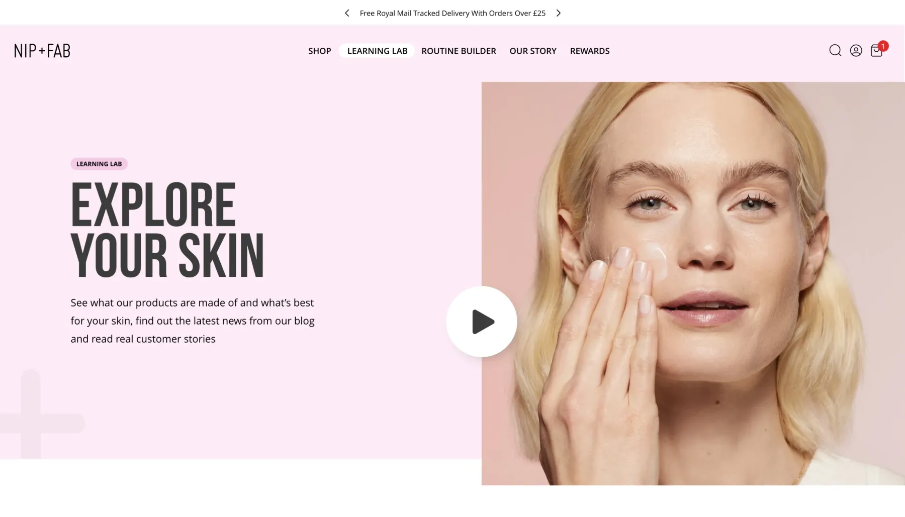
Content is key, once we had defined the user and their needs our UX team could plan the content that the user needed. This takes the form of information architecture, or a site map, and then for each page a content plan to decide what content hierarchy is needed.
User Interface Design
Each page template was then designed based on the wireframes created and the content required. The designs need to align to the brand whilst offering the user a clear and easy to understand interface to use.
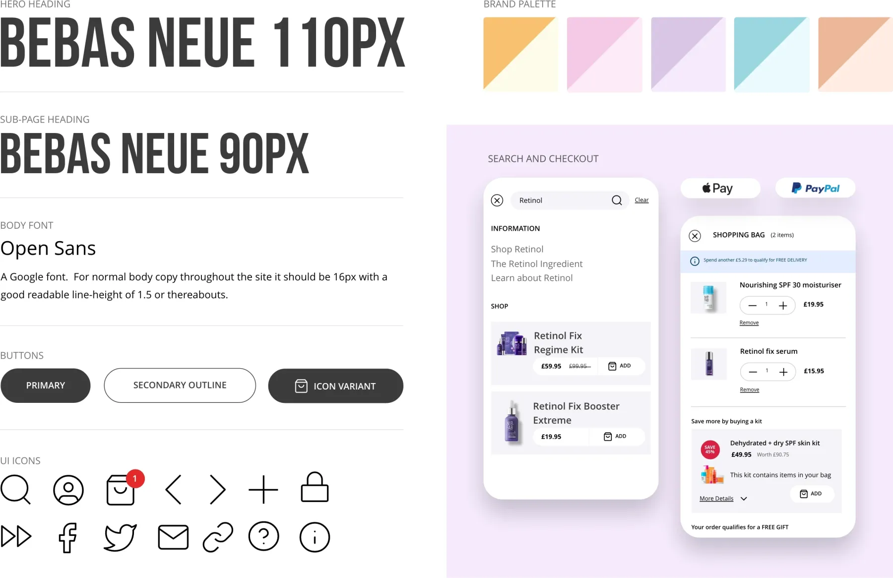
Creating a design system
In order to have consistency in the development process it was important to create a robust and flexible library of UI (user interface) patterns. Something that can be used as a guide for future pages of the site. When new design is needed it can then be added to the existing library.
We created rules for button use, colours, headings and showed how these elements combine to form a site-wide and coherent experience for the user.
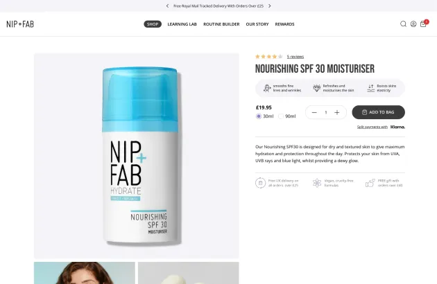
Being an e-Commerce site it was important to map out the entire user journey and design the flow through this purchase process, as well as create the right interface for that journey. Consistency of design was a key part of this.
The result
The finished design is simple in layout to aid the user journey, but with enough visual touches to give an essence of the Nip+Fab brand. It was important though that we did not overshadow the shopping process with overly complex layouts. The site structure and hierarchy was completely re-designed with more sections being added for users to learn about their products they are buying alongside the traditional e-Commerce experience. What we ended up with was a slick, minimal site which considered the user at every step.
Mobile-first design
Mobile users made up the vast majority of Nip+Fab’s visitors, so creating the site from the ground up from a mobile perspective was key. All design assets and UI patterns had to be easy to understand and intuitive to interact with. Any clunky interactions or confusing design could have led to visitors bouncing from the site and potentially not coming back.

“We were impressed by the level of detail that Pull brought to the project. The website design went far beyond just the look and feel. the entire customer journey was carefully considered, leading to a finished project that enhances the brand and educates the consumer”


